Aptos
Nuevo logo e identidad
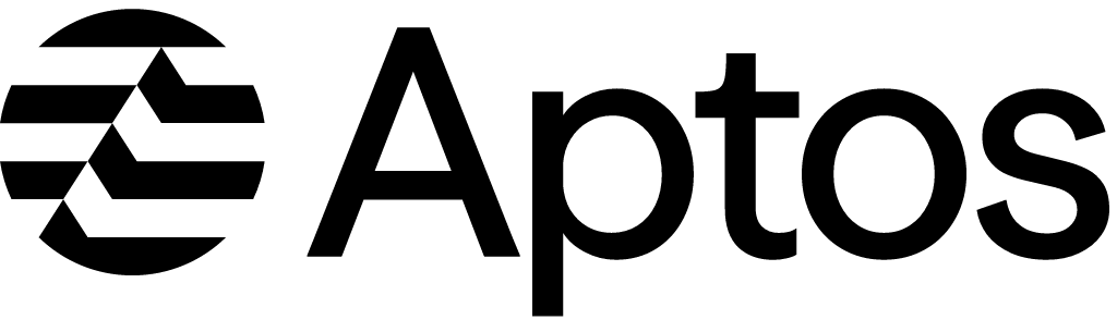
Logo de Aptos antes y después
AntesHasta octubre de 2025
Logo: Aptos. Fuente: aptosfoundation.org (archivado)
DescargarClaroSVGPNGVersión en modo oscuro adaptada por Rebrand Log
DespuésDesde el 15 de octubre de 2025
Logo: Aptos. Fuente: aptosnetwork.com (archivado)
DescargarClaroSVGPNGVersión en modo oscuro adaptada por Rebrand Log

Datos clave
Aptos presentó un nuevo logo el 15 de octubre de 2025, diseñado por Ashfall Studio.
- Marca
- Aptos
- Lanzamiento
- Tipografía
- Season (variable, de sans serif a serif)
- Qué cambió
- Nuevo logo e identidad.
- Fuentes
- ashfall.studio, aptosnetwork.com, linkedin.com
Cita esta página Rebrand Log, «Nuevo logo de Aptos (2025)», https://rebrandlog.com/es/rebrand/aptos/, última actualización .
Identidad · 15 imágenes
Aptos / Ashfall Studio, imagen de ashfall.studio · © Aptos / Ashfall Studio, a través de ashfall.studio · y otras personas (con crédito en el visor)
Razones
«Moving what matters»: Aptos se reposicionó más allá de las convenciones de la Web3 (fondos oscuros, neón, jerga) como un socio humano y de confianza; refinó su isotipo de la ola y sumó tipografía cinética con la tipografía variable Season, una paleta de color clara y cálida y patrones de retícula modular.
Cita
«Season, a variable typeface that transforms between sans and serif, thick and thin, anchors the brand's typographic system.»
Prensa
- underconsideration.comOff the Chain
- Asfall StudioAptos Brand Identity Case Study
- LinkedIn22 de octubre de 2025New Ashfall Studio launch: Brand identity for Aptos Foundation 🔥 By far our most ambitious project to date. Earlier this year, one of the Web3 giants came to us with an incredible brief. They… | Martin Ehrlich | 95 comments
Reacciones
- tree@treeonchain en X@TheAstornia @Aptos i actually like the new logo wonder how much it costed16 de octubre de 2025 · 0 me gusta
- 6533@tisszu1 en X@obsrvgmi @Aptos no community but new logo gz15 de octubre de 2025 · 0 me gusta
- JORDY🌐@0x7012dy en X@Aptos Iam realy love new logo , this is aptos new era 🫡🌐15 de octubre de 2025 · 6 me gusta
- DefiBNS@Defibns en X@Aptos This new logo is looking good and perfect. gAptos.5 de noviembre de 2025 · 2 me gusta
- 𝐋𝐞𝐤𝐒𝐢𝐝𝐞 (🦖)~🖥️@Mgw_WAGWAN en XSentiment Check: Aptos New Logo Feels like a quiet rebrand moment, but the vibes are mostly bullish. People read it as a maturity signal: @Aptos shifting from “emerging chain” to infrastructure-grade brand. The…16 de octubre de 2025 · 2 me gusta
- APTopia 🌐@APTopia_xyz en XIt’s been one week since @Aptos changed its logo, color theme, website design, and domain. Loving the Aptos brand refresh. New look, same ambition: building the most high-performance decentralized systems out there.…23 de octubre de 2025 · 35 me gusta
Fuentes
- 1. underconsideration.com · de pagohttps://www.underconsideration.com/brandnew/archives/new_logo_and_identity_for_aptos_by_ashfall_studio.php
- 2. ashfall.studiohttps://ashfall.studio/work/aptos/
- 3. aptosnetwork.comhttps://aptosnetwork.com/currents/the-new-era-of-aptos
- 4. linkedin.comhttps://www.linkedin.com/posts/martin-ehrlich_new-ashfall-studio-launch-brand-identity-activity-7386701674678996992-TpJu