Xerox (1994)
New logo.
Xerox logo before and after
BeforeUntil 1994
Xerox logo via Wikimedia Commons (author: The original uploader was Tvwade at English Wikipedia.). Source: commons.wikimedia.org
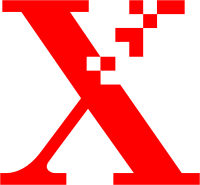
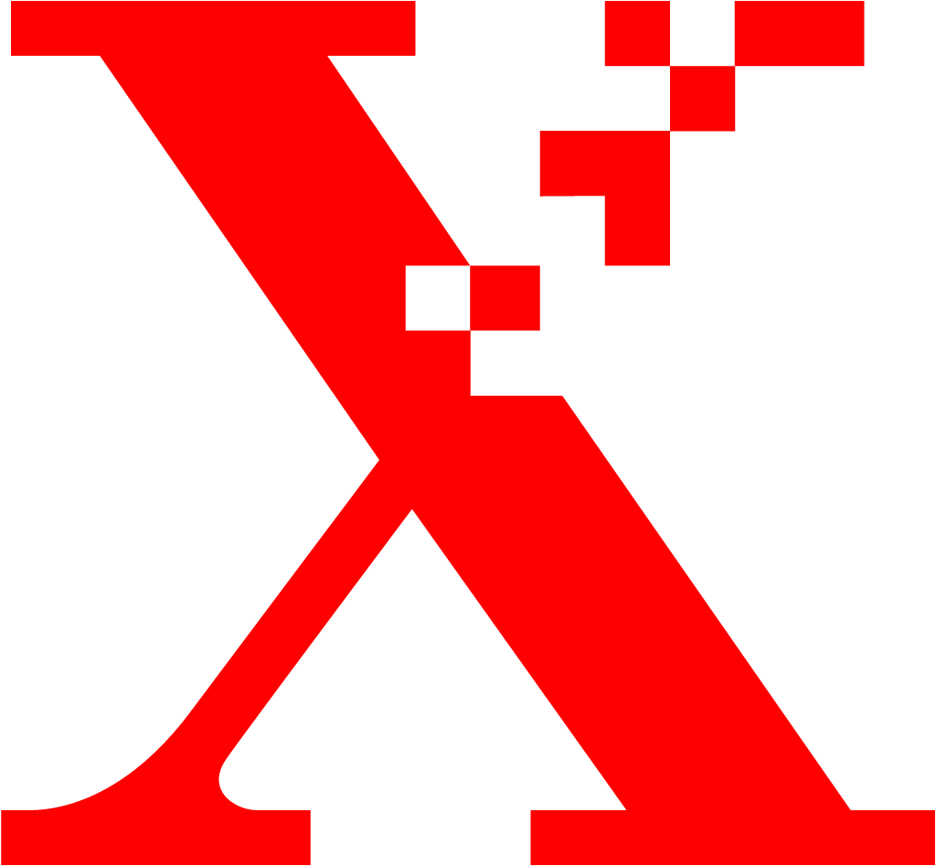
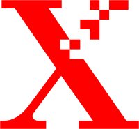
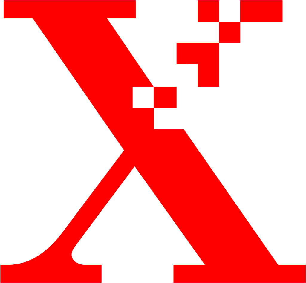
AfterSince 1994
Xerox logo via Wikimedia Commons (author: Landor Assoc. for Xerox Corporation). Source: commons.wikimedia.org
Key facts
Xerox launched a new logo in 1994.
- Brand
- Xerox
- Launched
- Studio
- Not recordedAdd it
- What changed
- New logo.
- Why
- Xerox said the new signature underscored the new Xerox, as it repositioned itself as the document company for a digital era.
- Sources
- washingtonpost.com, chicagotribune.com
- Logo history
- 2 rebrands
Cite this Rebrand Log, "Xerox new logo (1994)", https://rebrandlog.com/rebrand/xerox-1994/, last updated .
The Xerox rebrand, explained
By 1994 Xerox had a problem it could see coming. The Washington Post put it bluntly: as more documents lived inside computers, making a copy increasingly meant hitting print rather than walking to the copier. Chairman Paul Allaire conceded that electronic files would eventually overtake filing cabinets, and was steering a large effort to remake the company for the 21st century. The strategy, in his words to the Post, was to focus on being the document company.
The identity followed the strategy. Months before, in July, the Chicago Tribune's George Lazarus reported that sources said management had even been toying with renaming the company, an extraordinary thought for a brand whose name had become a verb. In the end the name stayed. According to the Post, four months after an April product extravaganza in New York, Xerox unveiled a new corporate logo, THE DOCUMENT COMPANY above Xerox, with a release saying the new signature underscored the new Xerox. The upper right arm of the X changed from a solid stroke into a cluster of broken boxes, to symbolise a digitised X. An advertising campaign of up to 8 million dollars that autumn was meant to herald the change.
The Post called the logo controversial, and its reporting explains why the identity raced ahead of the business. Xerox was selling high speed digital printers such as DocuTech, which had passed a billion dollars in sales, and new software to link them to computers worldwide. But analysts described a struggle between the copier veterans and the software people over how far to push into document management. One partner said he had expected a broader product range after hearing the sweeping vision. Management thinker Tom Peters said that, despite decades of diversification, Xerox was still basically a copier company.
That is the fairest verdict on the logo too. As a symbol, the pixelated X is clever and economical: one letter, half analogue, half digital, a whole strategy in a single stroke. As a promise it was premature. The signature line told customers what Xerox wanted to be, while the products were still mostly what it had been. Identities can lead a transformation, but this one shows the danger of a mark that is more confident than the company behind it. Still, as a period piece of the early digital age, it is one of the more memorable corporate symbols of the decade.
In short: Half copier, half pixel.
Sources
- 1. wikidata.orghttps://www.wikidata.org/wiki/Q152433
- 2. commons.wikimedia.orghttps://commons.wikimedia.org/wiki/File:Xerox_logo_1994.svg