Unilever
Unilever replaced its solid blue U, in use since 1990, with a U built from 25 small icons such as a sun, a bee and a heart, launched as part of its Vitality mission.
Unilever logo before and after
BeforeUntil May 2004
Logo: Unilever. Source: unilever.com (archived)
DownloadLightSVG not availablePNGDisplay versions adapted by Rebrand Log

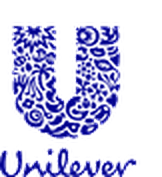
AfterSince 12 May 2004
Logo: Unilever. Source: unilever.com (archived)
DownloadLightSVG not availablePNGDisplay versions adapted by Rebrand Log

Key facts
Unilever launched a new logo on 12 May 2004.
- Brand
- Unilever
- Launched
- Studio
- Not recordedAdd it
- What changed
- Unilever replaced its solid blue U, in use since 1990, with a U built from 25 small icons such as a sun, a bee and a heart, launched as part of its Vitality mission.
- Why
- It was launched as part of the Vitality mission, which aimed to simplify the company and bring it closer to consumers.
Cite this Rebrand Log, "Unilever new logo (2004)", https://rebrandlog.com/rebrand/unilever-2004/, last updated .
The Unilever rebrand, explained
According to the Unilever Archives, the Blue Vitality design was unveiled on 12 May 2004 by the chairmen, in London and Rotterdam at the same time. It was launched as part of the Vitality mission, which aimed to simplify the company and bring it closer to consumers.
The logo it replaced was the Blue U of 1990, a solid letter in corporate blue above the name. The new U is made of 25 symbols, each standing for part of the business, from the sun, which the archive calls the ultimate symbol of all vitality and links to Port Sunlight, to the bee for creation, pollination, hard work and biodiversity. The name below was redrawn in a softer script.
The Grocer quoted chairman Niall FitzGerald at his last AGM: "Our old logo is reliable, solid, distinguished, and we don't want to lose those characteristics. But it is not, perhaps open enough to be introduced into everything we make." The paper put the cost of developing and marketing the logo at about 6.7 million pounds, and said Unilever planned to brand all of its goods with it by the end of 2005.
In short: One U, 25 tiny pictures, and a logo meant for every pack.
Quote
“Our old logo is reliable, solid, distinguished, and we don't want to lose those characteristics. But it is not, perhaps open enough to be introduced into everything we make.”
Press
Sources
- 1. archives-unilever.comhttps://www.archives-unilever.com/discover/stories/blue-vitality-logo-20th-anniversary
- 2. thegrocer.co.ukhttps://www.thegrocer.co.uk/news/unilever-unveils-new-friendlier-logo/93657.article
- 3. chiefmarketer.comhttps://www.chiefmarketer.com/unilever-launches-new-logo/
- 4. warc.comhttps://www.warc.com/en/article/unilever-says-%22goodbye%22-to-a-chairman-and-%22hello%22-to-a-logo-f0403a3031174488a9bbe28f7b0fafbe