Swisscom
May 2025 (Wolff Olins, NEO): moving lifeform symbol simplified/flattened, brighter red-blue, wordmark redrawn
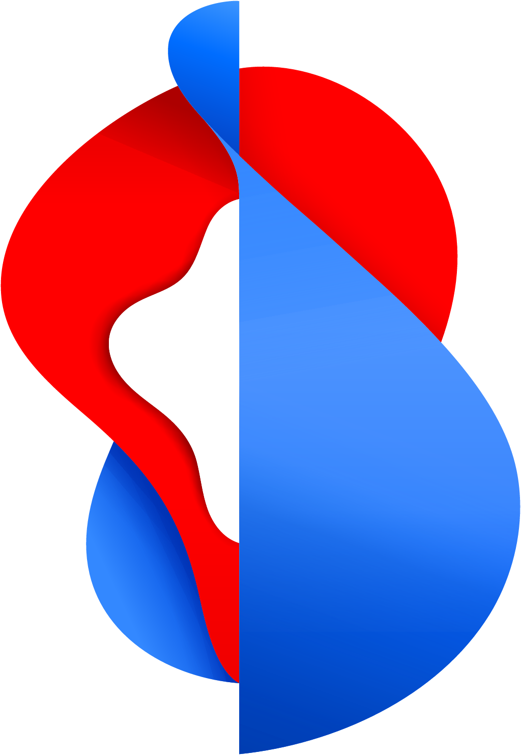
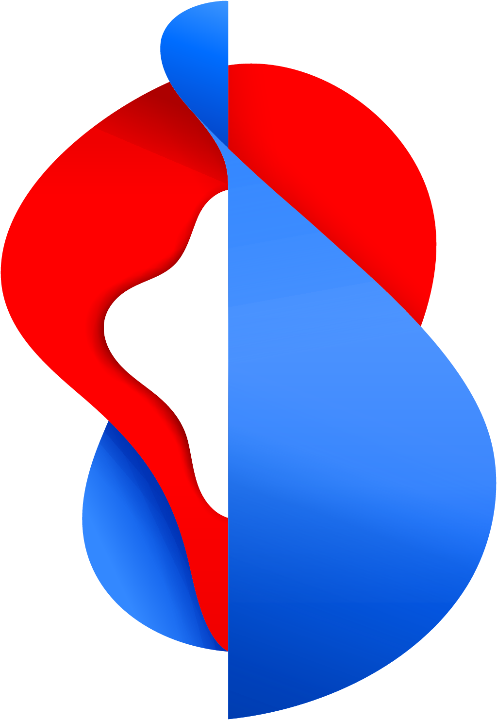
Swisscom logo before and after
BeforeUntil May 2025
Logo: Swisscom. Source: swisscom.ch (archived)




AfterSince May 2025
Logo: Swisscom. Source: swisscom.ch (archived)


Key facts
Swisscom launched a new logo in May 2025.
- Brand
- Swisscom
- Launched
- Source: swisscom.ch
- Studio
- Not recordedAdd it
- What changed
- May 2025 (Wolff Olins, NEO): moving lifeform symbol simplified/flattened, brighter red-blue, wordmark redrawn.
- Why
- Swisscom said competition from new technologies and new players made a strong brand that customers feel connected to more important than ever.
Cite this Rebrand Log, "Swisscom new logo (2025)", https://rebrandlog.com/rebrand/swisscom-2025/, last updated .
The Swisscom rebrand, explained
Swisscom is the rare telecom brand that is genuinely loved at home. The company says virtually everyone in Switzerland knows it, and that Brand Finance ranks it among the world's strongest telecom brands. So the May 2025 update was not a rescue. Head of brand Olaf Geuer said the brand was well positioned, but competition from new technologies and new players made a brand customers feel connected to more important than ever. A cross divisional team refined the positioning and launched a new communication platform.
An awards entry for the project on the German Brand Award site describes the research behind it. External studies and internal interviews pointed to a need to add approachability, confidence and dynamism, and identified which assets and colours were most strongly tied to Swisscom. The goal was to keep the brand strong for the next decade without losing familiarity, a challenge the jury noted is especially demanding for a corporate brand rooted in national identity.
The visual change is measured. Swisscom said it gently refreshed the identity with a slightly updated logo, fresher colours and new imagery. Le Cercle du Branding reported that the emblematic sculptural 3D symbol was kept but lightened in its volumes and slightly simplified, to improve legibility in digital contexts while keeping strong recognition. Around it sits a new visual system called Guiding Light, inspired by the light of Alpine landscapes and meant to express guidance and trust.
The tagline changed too. Ready together gave way to Discover your possibilities, which Geuer said conveys confidence and approachability and focuses on action, inviting people to discover what new technology makes possible. The launch campaign leaned into that: a film about a father who uses generative AI to write a bedtime story for his six year old daughter, about a princess who wants to be a monster, which Swisscom then printed as a real children's book with a guide to making your own.
This is responsible stewardship of a valuable asset. The old symbol was distinctive but heavy, and flattening its volumes is the right call for screens. Guiding Light is an evocative idea, rooted in Swiss landscape without falling into cliché. The new slogan is less distinctive than the design; Discover your possibilities could belong to any tech company. And building the launch around generative AI is a bold bet for a brand defined by trust, though the children's book makes it unusually warm.
In short: Lighter volumes, Alpine light.
Sources
- 1. swisscom.chhttps://www.swisscom.ch/en/about/news/2025/05/19-neue-markenpositionierung.html
- 2. german-brand-award.comhttps://www.german-brand-award.com/en/gallery/detail/brand-design-corporate-brand/swisscom-neo-repositioning-a-swiss-icon
- 3. cercledubranding.frhttps://www.cercledubranding.fr/2025/05/21/swisscom/