NTT Docomo
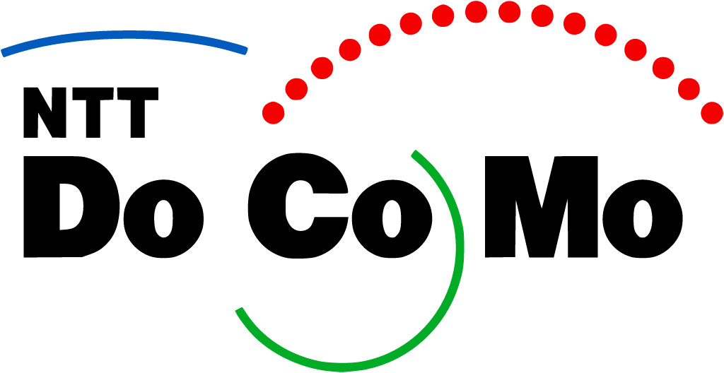
Jul 2008: black "DoCoMo" with red dotted loop replaced by lowercase "docomo" in Docomo Red
NTT Docomo logo before and after
BeforeUntil Jul 2008
NTT Docomo logo via Wikimedia Commons (author: NTT DoCoMo). Source: commons.wikimedia.org
AfterSince Jul 2008
NTT Docomo logo via Wikimedia Commons (author: Unknown authorUnknown author). Source: commons.wikimedia.org


Key facts
NTT Docomo launched a new logo in Jul 2008.
- Brand
- NTT Docomo
- Launched
- Source: docomo.ne.jp
- Studio
- Not recordedAdd it
- What changed
- Jul 2008: black "DoCoMo" with red dotted loop replaced by lowercase "docomo" in Docomo Red.
- Why
- DoCoMo said the new logo and branding embodied a commitment to customer satisfaction and stronger relationships with customers after a review of its brand strategy.
- Sources
- docomo.ne.jp, itmedia.co.jp
Cite this Rebrand Log, "NTT Docomo new logo (2008)", https://rebrandlog.com/rebrand/ntt-docomo-2008/, last updated .
The NTT Docomo rebrand, explained
Japan's biggest mobile operator did not rebrand from a position of strength. On 18 April 2008 NTT DoCoMo and its eight regional subsidiaries unveiled a new corporate logo and branding to be introduced from 1 July. ITmedia reported that the new mark spelled docomo in lowercase letters, replacing the loop logo the company had used for 15 years, and that DoCoMo had chosen red, never before formally set as its corporate colour, to express warmth and passion.
The company's English release said red symbolised energy and dynamism, and that the logo and a new slogan, Unlimited Potential, in Your Hand, expressed a commitment to customer satisfaction, closer relationships and innovation. The changes followed a review of branding and marketing after DoCoMo set up a corporate branding division in August 2007. ITmedia added that the lowercase lettering was chosen to feel more approachable.
The interesting part is the candour about why. President Masao Nakamura told reporters he felt DoCoMo's brand power was falling and the situation was a crisis. Mobile number portability, launched in autumn 2006, had been a big shock, he said; newspapers had described DoCoMo as the lone loser, and that was accurate. ITmedia noted that aggressive pricing from SoftBank Mobile had pulled customers away and that DoCoMo's domestic share had dipped below 50 percent in fiscal 2007 for the first time in 11 years. Nakamura admitted existing customers had long been unhappy: handsets were free for new subscribers but cost 30,000 yen to upgrade.
So the logo came with a New DoCoMo Declaration promising to deepen bonds with customers and exceed their expectations, plus concrete measures such as free battery packs for loyal users and home visits within 48 hours to fix signal problems. Nakamura had asked Masahiko Uotani, chairman of Coca-Cola Japan, to help with the refresh, and Uotani told ITmedia staff were trapped by past success. The internal change programme, ONE docomo, was explained to employees for three months before the public launch.
Lowercase red docomo is a gentler, more consumer friendly mark than the busy loop, and choosing a single owned colour was overdue. But the logo was the least important part of this story. It is a rare example of a company admitting that a rebrand was a response to losing, and pairing it with changes to how customers are treated.
In short: A softer logo for a company admitting it was losing.
Sources
- 1. docomo.ne.jphttps://www.docomo.ne.jp/english/info/media_center/pr/2008/001394.html
- 2. itmedia.co.jphttps://www.itmedia.co.jp/news/article/0804/18/1080418100/
- 3. itmedia.co.jphttps://www.itmedia.co.jp/mobile/articles/0804/18/news063.html