Nokia
Bold blue wordmark replaced by a thin, abstracted geometric wordmark that reads only when the letters work together
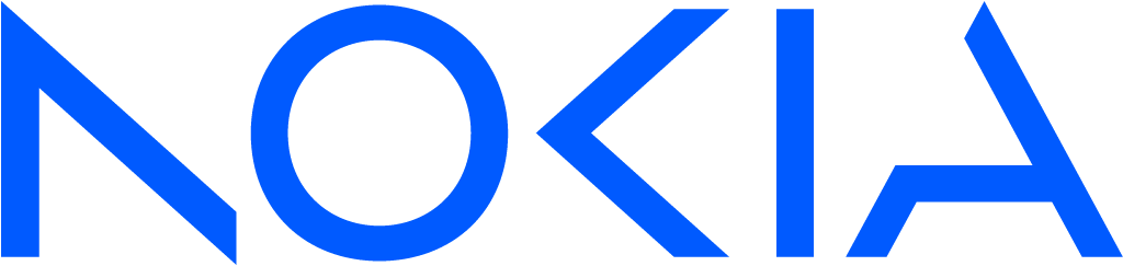
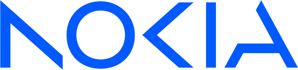
Nokia logo before and after
BeforeUntil Feb 2023
Logo: Nokia. Source: nokia.com (archived)




AfterSince 26 Feb 2023
Logo: Nokia. Source: nokia.com (archived)


Key facts
Nokia launched a new logo on 26 Feb 2023, designed by Lippincott.
- Brand
- Nokia
- Launched
- What changed
- Bold blue wordmark replaced by a thin, abstracted geometric wordmark that reads only when the letters work together.
- Why
- Nokia changed its identity because, its chief executive said, people still saw it as a mobile phone brand when it had become a B2B technology company.
- Sources
- nokia.com, lippincott.com, buzzsprout.com
Cite this Rebrand Log, "Nokia new logo (2023)", https://rebrandlog.com/rebrand/nokia/, last updated .
The Nokia rebrand, explained
Key people: Pekka Lundmark (CEO, Nokia)
Most people still associate Nokia with phones, a business it had long left. At Mobile World Congress in February 2023, the company unveiled a new strategy built on networks meeting cloud, and a new identity meant to help customers see it in a new light. The pitch was B2B technology, not consumer gadgets.
Chief executive Pekka Lundmark was blunt about why. In most people's minds, he told Bloomberg and Fortune, Nokia was still a successful mobile phone brand, and that was not what Nokia was about. Reuters called it the first change to the brand identity in nearly 60 years. Lundmark had taken over in 2020 with a plan of reset, accelerate and scale; the logo marked the move from the first stage to the second.
The old wordmark, bold blue capitals unchanged in essence for more than half a century, was the thing everyone recognised. The redesign simplified its geometry and abstracted each letter into thin, angular strokes, so that individually they barely read, and only together spell Nokia. That is the concept: a mark about collaboration. The heavy blue gives way to a kaleidoscopic, digital-first palette and bold imagery, which the design team says is meant to cut through the telecom sector's sea of sameness.
Nokia's announcement did not dwell on the outside designers. Its brand chief Stacey Brierley called the result a bold evolution of the 1960s classic, with letters that read as Nokia only when they act together. Meanwhile HMD Global, which licenses the name for phones, told The Verge it would keep using the classic logo on its handsets, so the old mark carried on in shops.
The trade press was divided. Creative Bloq grouped it with Kia's and The Verge's slashed letterforms and collected reader complaints about legibility, one noting that without context it might read as AOCIA, alongside others who praised it as sharp and forward-looking.
Conceptually it is tidy, and it does exactly what Nokia needed: the logo no longer looks like it belongs on a handset. But the thin strokes sacrifice the solidity that made the old mark feel trustworthy, and at a glance the letters can drift apart. For a company selling network infrastructure, that is a strange quality to emphasise, even if it is a deliberate one.
In short: A clean break from phones, at the cost of the old mark's weight and certainty.
Identity · 5 images
Nokia / Lippincott, image from lippincott.com · © Nokia / Lippincott, via lippincott.com
Rationale
Unveiled at MWC to reposition Nokia away from phones toward B2B technology where "networks meet cloud"; the letterforms rely on each other, signalling collaboration.
Press
Reactions
- Lalit_Luis@Lalit_Luis on X@dorso10 The new logo is modern and futuristic. But I can't see the point behind doing all of this. @nokia will probably stop making smartphones completely and focus on their tech business with this new logo.27 Feb 2023 · 0 likes
- Akin Ayo@_Akinayo on X@razecdzn Between this new logo for NOKIA and the KIA new logo, I can't seem to decide on the worse one. Nokia doesn't need a design rebrand, it needs top-of-the-line products that would help it start gaining lost…27 Feb 2023 · 0 likes
- Alvin Foo@alvinfoo on XThis is Nokia’s new logo! For the first time in nearly 60 years, one-time smartphone giant Nokia is changing its iconic logo. #Nokia reveals new logo to remind you it doesn’t make phones anymore. #MWC2023 #MWC23…27 Feb 2023 · 56 likes
- Vijay Shekhar Sharma@vijayshekhar on X#Nokia got a new logo today in 60 years. They so much want to shed their “mobile device” past. What do you think about their new logo?26 Feb 2023 · 453 likes
- Tomasz Zakrzewski@Titanic1337 on X@verge Nokia could've kept the old logo. With the new logo, they seem to change the name from Nokia to Aocia, as the new logo is nearly unreadable.27 Feb 2023 · 30 likes
- Every Movie Plug@everymovieplug on XNokia has unvieled a new logo. Which design looks better? Classic logo or New Logo4 Mar 2023 · 99 likes
Sources
- 1. nokia.comhttps://www.nokia.com/newsroom/nokia-sets-sights-on-leading-a-world-where-networks-meet-cloud-mwc23/
- 2. lippincott.comhttps://www.lippincott.com/work/nokia/
- 3. reuters.comhttps://www.reuters.com/technology/nokia-changes-iconic-logo-signal-strategy-shift-2023-02-26/