NASA
NASA retired the red "worm" logotype by Danne & Blackburn and brought back the 1959 blue "meatball" insignia, with its planet, stars, red wing and orbiting spacecraft around the name.
NASA logo before and after
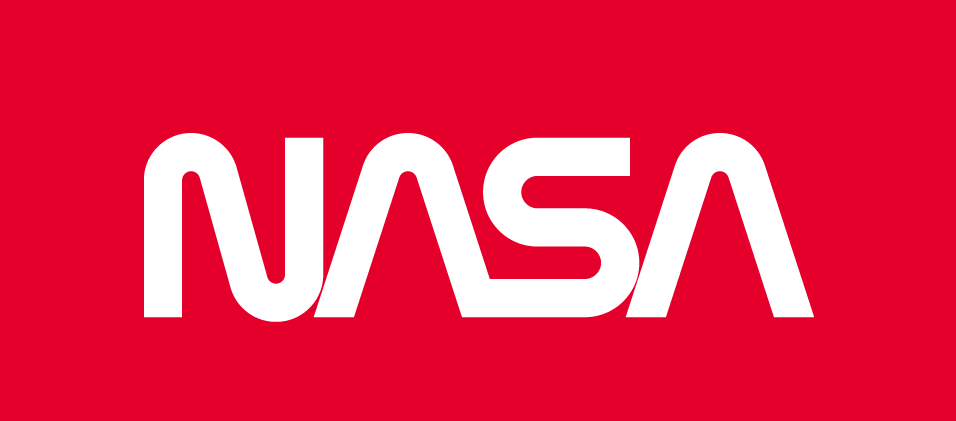
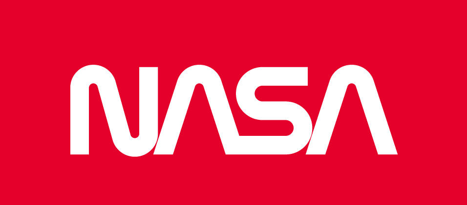
BeforeUntil May 1992
NASA logotype (worm), official NASA Brand Center guidelines image, cropped to the white-on-red panel. Dark mode shows a vectorised version adapted by Rebrand Log. Source: nasa.gov
DownloadLightSVG not availablePNGDark mode version adapted by Rebrand Log
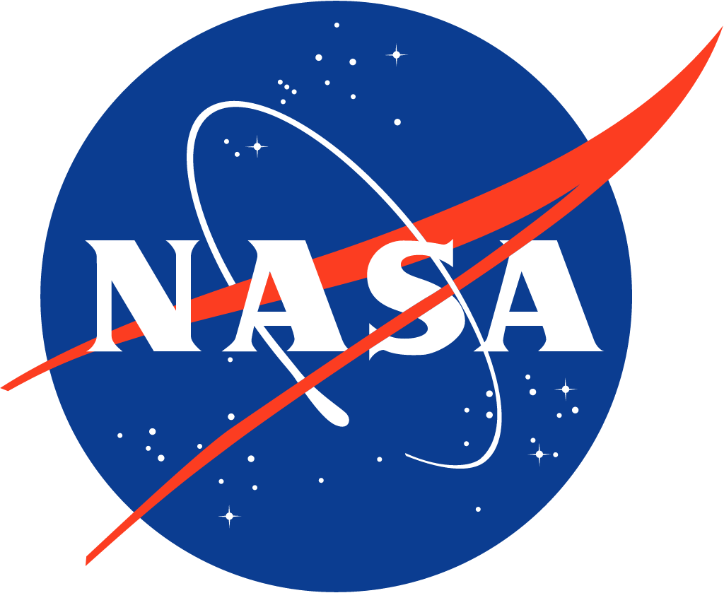
AfterSince May 1992
NASA insignia ("meatball") from the official website nasa.gov. Source: nasa.gov


Key facts
NASA launched a new logo in May 1992.
- Brand
- NASA
- Launched
- Studio
- Not recordedAdd it
- What changed
- NASA retired the red "worm" logotype by Danne & Blackburn and brought back the 1959 blue "meatball" insignia, with its planet, stars, red wing and orbiting spacecraft around the name.
Cite this Rebrand Log, "NASA new logo (1992)", https://rebrandlog.com/rebrand/nasa-1992/, last updated .
The NASA rebrand, explained
NASA's round insignia was designed in 1959 by James Modarelli, an employee at what became the Glenn Research Center. The blue sphere is a planet, the stars are space, the red chevron is a wing, inspired by a hypersonic aircraft model Modarelli saw in a wind tunnel, and an orbit circles the name. Nobody called it the meatball until it was replaced.
That happened in 1975. Under the Federal Design Improvement Program, Danne & Blackburn drew a red, stylised NASA, which everyone soon called the worm, together with a famously thorough graphics standards manual. NASA later noted that the logo was honoured by President Reagan in 1984. To designers it became a favourite; the critic Alice Rawsthorn, quoted by WIRED, called it "the design purists' favorite."
In May 1992 the new administrator, Dan Goldin, visited Langley Research Center on a Thursday and noticed the meatball had never been taken off the hangar. NASA was in a slump and Goldin saw a way to lift morale. He asked whether he could bring the old insignia back and was told that he should. The Langley director, Paul Holloway, later summed up the speed of it: "By Friday morning the worm was out, and the meatball was back." In NASA's own history, Goldin wanted to recall the Apollo glory days and show that "the magic is back at NASA."
The switch was so sudden that staff had to hunt for old logos; Goldin wore a borrowed meatball lapel pin. Designers were less pleased. "It wasn't back to the future," Loges, who wrote the graphics manual, told WIRED. "It was back to the past." Richard Danne wrote in 2011 that "reflecting back on the NASA program, it is still painful."
The story has a happy ending for both logos. In April 2020 NASA announced "The worm is back", painting it on the Falcon 9, while confirming that the meatball "will remain NASA's primary symbol." It seems a space agency can have two logos, provided nobody asks which one is the real one.
In short: Out on Friday, back for good: the meatball beats the worm.
Quotes
Press
Sources
- 1. nasa.govhttps://www.nasa.gov/history/nasas-meatball-logo/
- 2. nasa.govhttps://www.nasa.gov/history/symbols-of-nasa/
- 3. nasa.govhttps://www.nasa.gov/general/the-worm-is-back/
- 4. wired.comhttps://www.wired.com/2015/09/nasa-graphics-standards-manual/