Michelin
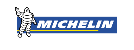
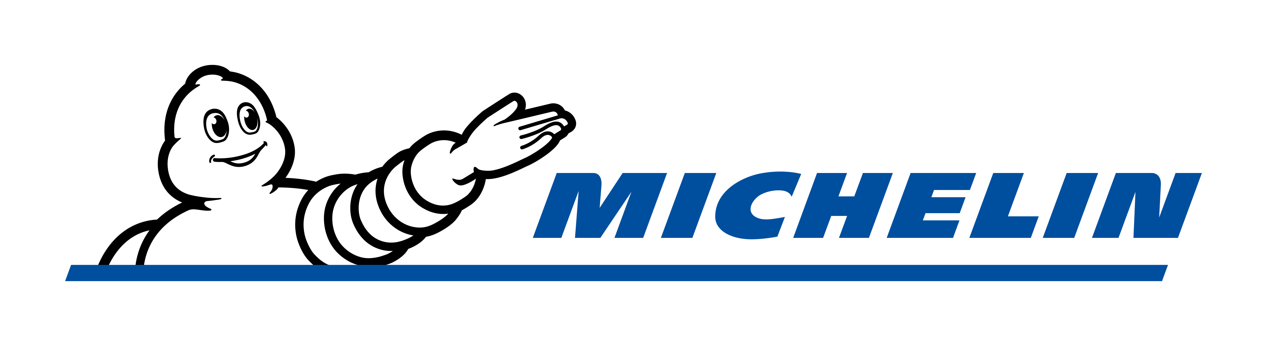
Michelin took the Michelin Man out of his place beside a framed blue box and set a flat line drawing of him, reaching forward with an open hand, over a blue italic wordmark and a long blue rule.
Michelin logo before and after
BeforeUntil Jun 2017
Michelin logo (before 2017), the logo file on michelin.com, archived capture. Source: arquivo.pt
DownloadLightSVGPNG not availableDark mode version adapted by Rebrand Log
AfterSince Jun 2017
Michelin group logo (2017), the logo file on michelin.com, archived capture. Source: arquivo.pt
DownloadLightSVGPNG not availableDark mode version adapted by Rebrand Log
Key facts
Michelin launched a new logo in Jun 2017.
- Brand
- Michelin
- Launched
- Studio
- Not recordedAdd it
- What changed
- Michelin took the Michelin Man out of his place beside a framed blue box and set a flat line drawing of him, reaching forward with an open hand, over a blue italic wordmark and a long blue rule.
Cite this Rebrand Log, "Michelin new logo (2017)", https://rebrandlog.com/rebrand/michelin-2017/, last updated .
The Michelin rebrand, explained
The press kit says Michelin would move from one logo to two by the end of 2017, one for the group and one for the Michelin trademark, and that the trademark logo would follow a few weeks later. It adds: "By positioning the Michelin Man at the center of the new logo without a frame around him, we are forcefully reaffirming this symbolic value." It does not name a design studio, and we found no official credit.
The old logo, from an archived capture of michelin.com in February 2017, shows a waving Michelin Man in black outline with a white body, standing to the left of a blue box with a thin white edge. Michelin sits in white bold italic capitals inside the box, over a yellow line.
The new group logo, from an archived capture of michelin.com in April 2018, shows the Michelin Man from the chest up in black outline and white, one arm stretched forward with the hand open. Michelin is set in blue italic capitals beside the arm, above a long blue rule, with no box.
In short: In 2017 Michelin freed the Michelin Man from the blue box and had him point the way over a blue italic wordmark.
Sources
- 1. dgaddcosprod.blob.core.windows.nethttps://dgaddcosprod.blob.core.windows.net/corporate-production/attachments/clktcc83j04iv2fhh1nqq1fwc-20170613-michelin-dp-movinon-en.pdf
- 2. arquivo.pthttps://arquivo.pt/wayback/20170215052310/http://www.michelin.com/eng/content/download/62/384090/version/750/file/Logo_MICHELIN.svg
- 3. arquivo.pthttps://arquivo.pt/wayback/20180412030316/https://www.michelin.com/content/download/62/384091/version/810/file/Logo_Michelin_group_horizontal.svg