Kyivstar
New logo.
Kyivstar logo before and after
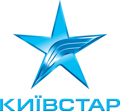
BeforeUntil Jun 2015
Kyivstar logo via Wikimedia Commons (Kyivstar logo (before 2015).png). Source: commons.wikimedia.org
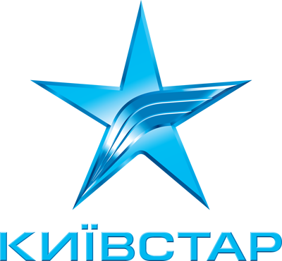
AfterSince Jun 2015
Kyivstar logo via Wikimedia Commons (Kyivstar logo.svg). Source: commons.wikimedia.org




Key facts
Kyivstar launched a new logo in Jun 2015, designed by Saffron Brand Consultants.
- Brand
- Kyivstar
- Launched
- Source: underconsideration.com
- What changed
- New logo.
- Why
- Kyivstar said it updated its style to match its new values of simplicity, innovation and quality and modern design trends, while keeping its star and gaining a national identity.
- Sources
- brandemia.org, expert.com.ua
Cite this Rebrand Log, "Kyivstar new logo (2015)", https://rebrandlog.com/rebrand/kyivstar-2015/, last updated .
The Kyivstar rebrand, explained
Kyivstar had led Ukrainian telecoms for nearly two decades when it decided to look the part of a modern brand. In 2015 the company announced a new stage in its work, organised around three values, simple, innovative and better, and a refreshed visual style. Its research showed customers' top priorities had become simplicity, transparent tariffs, innovation and reliable service, and president Pyotr Chernyshov said that in a fiercely competitive market, standing still meant stagnating and leadership had to be shown every day.
Brandemia explained the strategic trigger: a decision to unify the company's commercial efforts into a single monobrand covering fixed line, mobile, TV and internet, much as Movistar had done in 2010. Full integration of services was new to the Ukrainian market, and Kyivstar wanted to stress that it could bring the widest fixed network, the most reliable mobile network and pioneering TV and internet together in simple, affordable packages. The guiding brand idea was Better together, with a promise to lead by example in a market where opacity and nasty surprises were common.
Visually, the problem was a generic identity and a cold, distant logo. Working with Saffron, Kyivstar kept the star but redrew it as a rounded, flexible icon that turns the star into something like a person leaping with joy. Marketing director Sviatoslav Horban said the update was meant to match the new values and modern design trends: minimalism, relevance for different audiences and adaptability to any setting, while keeping the star and the name and gaining a national identity. The palette draws on Ukraine's colours, celebrating Kyivstar's status as the only national telecoms brand in the country, with blue leading and yellow dots building a visual language centred on people enjoying technology rather than products. A new store concept with the architects Malka and Portus removed barriers between staff, customers and products.
Brandemia praised the result as fun, approachable and simple, noting that the star also reads as a twinkling spark or an excited jumping figure. That reading holds up. The redesign keeps all the recognition of the old star while giving it warmth, and the national colours were a deliberate statement. The risk with a humanised mark is whimsy, but here it is restrained enough to carry a serious network.
In short: A cold star learns to jump.
Press
Sources
- 1. underconsideration.com · paywalledhttps://www.underconsideration.com/brandnew/archives/new_logo_for_kyivstar.php
- 2. expert.com.uahttps://expert.com.ua/en/95682-kievstar-osushhestvil-rebrending.html
- 3. brandemia.orghttps://brandemia.org/la-telco-lider-en-ucrania-tiene-nueva-identidad-corporativa-por-saffron