IKEA
IKEA updated its blue and yellow logo in 2018, the first revamp since the 1980s, to improve legibility and color reproduction in the digital age. The IKEA letters grew bigger and heavier inside the yellow oval, the registered mark moved into the oval and the blue turned deeper.
IKEA logo before and after
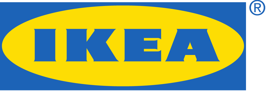
BeforeUntil 2018
IKEA logo (before 2018) from the cover of the Inter IKEA Group Financial Summary FY17 (inter.ikea.com). Source: inter.ikea.com

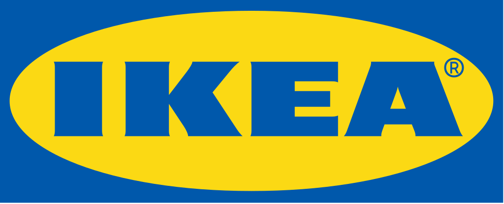
AfterSince 2018
IKEA logo (2018) from page 12 of the Inter IKEA Group Financial Summary FY19 (inter.ikea.com). Source: inter.ikea.com

Key facts
IKEA launched a new logo in 2018.
- Brand
- IKEA
- Launched
- Studio
- Not recordedAdd it
- What changed
- IKEA updated its blue and yellow logo in 2018, the first revamp since the 1980s, to improve legibility and color reproduction in the digital age. The IKEA letters grew bigger and heavier inside the yellow oval, the registered mark moved into the oval and the blue turned deeper.
- Sources
- ikeamuseum.com, inter.ikea.com, inter.ikea.com
Cite this Rebrand Log, "IKEA new logo (2018)", https://rebrandlog.com/rebrand/ikea-2018/, last updated .
The IKEA rebrand, explained
The logo grew out of decades of small steps. The IKEA Museum traces it from the first registered trademark in 1943 to a version in an oval and a rectangle in the 1960s, set in an in-house typeface based on an extra-bold Futura. In 1984 IKEA wrote its first visual profile manual, and around that time the logo became a registered trademark. From 1991 every new store was built blue with the yellow IKEA wordmark on the facade.
The museum explains the 2018 update simply: the same logo now has to work as well on a mobile screen as on a store front or a paper bag. It gives the year only and names no design studio.
The files show the change. In the older logo, from the cover of the Inter IKEA Group Financial Summary FY17, blue IKEA letters sit in a yellow oval on a blue rectangle, with the registered mark outside the rectangle at the top right. In the 2018 logo, from the group's FY19 summary, the letters are bigger and heavier and fill more of the oval, the registered mark sits inside the oval and the blue is a deeper shade.
In short: In 2018 IKEA gave its 1980s blue and yellow logo bigger, heavier letters, moved the registered mark into the oval and deepened the blue so it would read better on small screens.
Sources
- 1. ikeamuseum.comhttps://www.ikeamuseum.com/en/explore/the-story-of-ikea/history-of-the-logotype/
- 2. inter.ikea.comhttps://www.inter.ikea.com/-/media/interikea/igi/financial-reports/inter-ikea-group-financial-summary-fy17.pdf
- 3. inter.ikea.comhttps://www.inter.ikea.com/-/media/interikea/igi/financial-reports/inter-ikea-group-financial-summary-fy19.pdf