Daum (2025)
Jan 2025: four-colour stacked Daum -> single deep-blue Daum wordmark
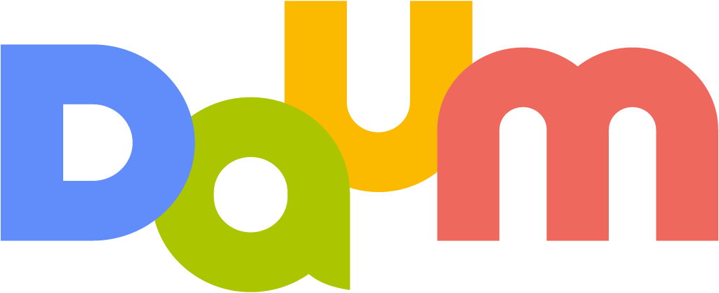
Daum logo before and after
BeforeUntil Jan 2025
Daum logo via Wikimedia Commons (author: Daum (Kakao Corp.), Vectorization: YeBoy371). Source: commons.wikimedia.org


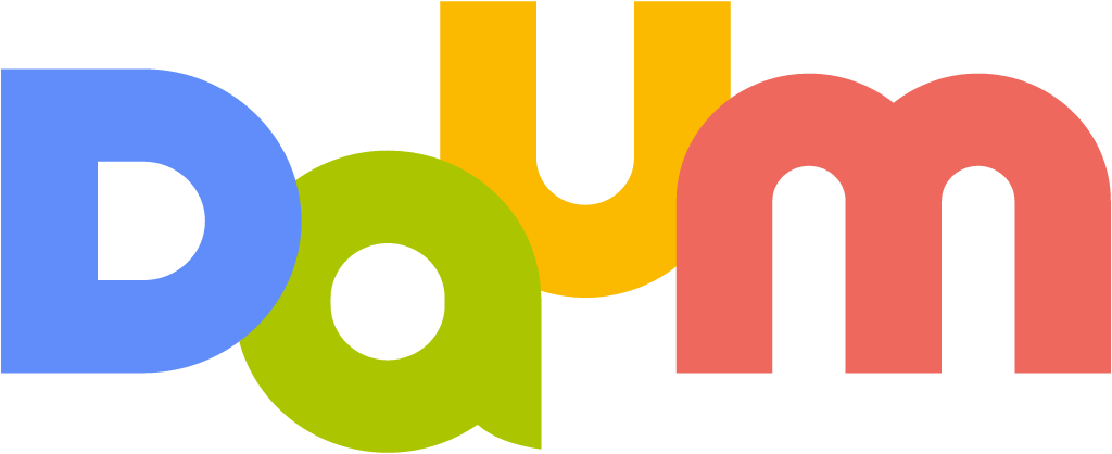
AfterSince Jan 2025
Daum logo via Wikimedia Commons (author: Daum (Kakao Corp.), Vectorization: Namoroka). Source: commons.wikimedia.org




Key facts
Daum launched a new logo in Jan 2025.
- Brand
- Daum
- Launched
- Source: magazine.daum.net
- Studio
- Not recordedAdd it
- What changed
- Jan 2025: four-colour stacked Daum -> single deep-blue Daum wordmark.
- Why
- Daum said the old four-colour logo with letters at different heights felt complicated and dated, and its mixed brightness blurred its edges against some backgrounds.
- Sources
- magazine.daum.net, seoul.co.kr, ditoday.com
- Logo history
- 2 rebrands
Cite this Rebrand Log, "Daum new logo (2025)", https://rebrandlog.com/rebrand/daum-2025/, last updated .
The Daum rebrand, explained
Daum's design team announced the change on 10 January 2025, three days before a redesign of the Daum app with four new bottom tabs. The company said the old logo, with four colours mixed together and letters at different heights, often felt complicated and dated, and that the brightness differences between its colours blurred the logo's edges against some backgrounds. Its answer was a single new colour, Deep Blue, which it described as the colour at the very centre when the old logo's four colours overlap, a colour made from diversity gathered into one, chosen to project a more trustworthy image.
Seoul Shinmun reported on 14 January that the change, made by Kakao's in-house content company, was Daum's first logo change in 12 years. The red, yellow, light green and blue combination was unified in deep blue, the DAUM letters were aligned to the same height, and the type kept its earlier form with slightly rounded corners. Reaction online was mostly negative. Users asked why colourfulness, the brand's identity, had been dropped, and many said the near black blue evoked a funeral home or a funeral services company.
DIGITAL iNSIGHT, looking back a year later, reported that the deep blue mark had indeed been dropped. Daum's new operator AXZ said it had received a lot of feedback that the brand felt less like Daum after the switch to monochrome, and in March it restored four colours. The returning logo is not a simple rollback: it keeps the level, modern letter skeleton introduced in 2025, with colours tuned toward deeper pastel tones, and the D symbol gained a gradient of the four colours.
The diagnosis in 2025 was sound. A logo with mismatched heights and clashing brightness is hard to use on screens, and leveling the letters was a real improvement that survived the reversal. The mistake was treating the colours as the problem. They were the brand, and against Naver's green and Kakao's own yellow, a dark blue that reads as grey on many screens made Daum disappear. The explanation, that deep blue is what all the colours make together, was clever on paper and meaningless to anyone looking at it. The rollback proves the point.
In short: A sober blue that lasted one year.
Sources
- 1. magazine.daum.nethttps://magazine.daum.net/daum_notice/677f745af8cd1456677fcdbb
- 2. cs.daum.nethttps://cs.daum.net/notice/797?selectedCategoryId=