Cohere
Three-cell "C" logo, cell-like and Voronoi visual language, custom type and natural-synthetic palette
Cohere logo before and after
BeforeUntil Mar 2023
© Cohere, via the company's website (archived). Source: cohere.ai (archived)
DownloadLightSVG not availablePNGDarkSVG not availablePNGDark mode version adapted by Rebrand Log
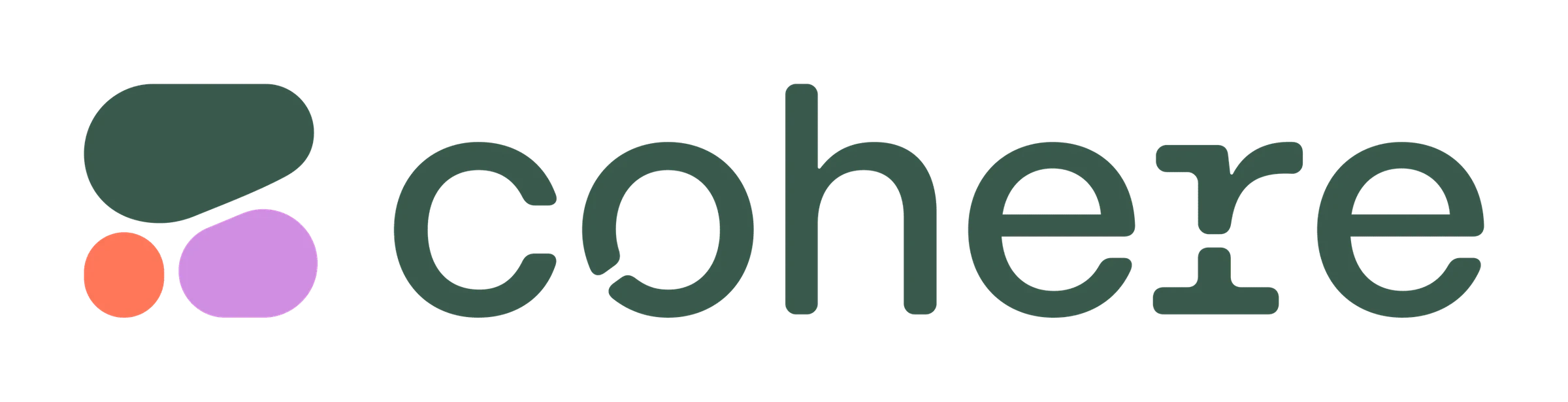
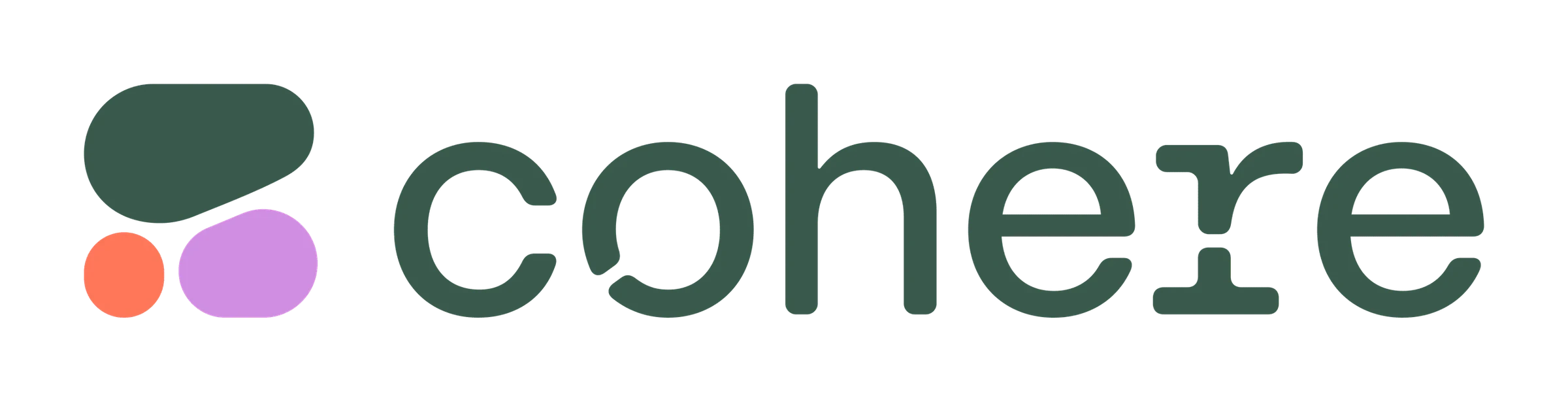
AfterSince 29 Mar 2023
Cohere logo via Wikimedia Commons (uploader/author: Ayub MK09). Source: commons.wikimedia.org
DownloadLightSVG not availablePNGDarkSVG not availablePNGDark mode version adapted by Rebrand Log
Key facts
Cohere launched a new logo on 29 Mar 2023, designed by Pentagram.
- Brand
- Cohere
- Launched
- Typeface
- Custom typefaces
- What changed
- Three-cell "C" logo, cell-like and Voronoi visual language, custom type and natural-synthetic palette.
- Sources
- itsnicethat.com, cohere.com
Cite this Rebrand Log, "Cohere new logo (2023)", https://rebrandlog.com/rebrand/cohere/, last updated .
The Cohere rebrand, explained
On 29 March 2023 Cohere, a language AI platform built for businesses, introduced a new look. Its announcement, signed by its lead designer and co-founder and chief executive Aidan Gomez, framed it with the line that, like language, Cohere's brand had evolved.
It's Nice That reported that the identity set out to subvert the imagery surrounding AI. That meant avoiding the Corporate Memphis look of flat geometric illustration common among tech startups, as well as obscure, sci-fi-heavy tropes, and focusing instead on the usability of the product.
Symbols from the natural world form the basis of the design. The team drew on biology, specifically the visual language of cells, and augmented the cell form with Voronoi diagrams, a pattern found in nature and architecture, from a giraffe's coat to honeycomb. The system partitions an infinite number of cells, which the magazine admitted is not the simplest concept to grasp, but at its core it merges the organic and the artificial, much as language models do. The new logo features a symbol and wordmark based on the cell, with a custom typeface, bespoke colour palette, icons and pictograms.
Rejecting both cartoon illustration and glowing neural networks is the right instinct. Business buyers of AI want reassurance, and an identity that suggests growth and natural structure is calmer than one that suggests a robot.
The concept is heavier than it needs to be, and nobody will read Voronoi geometry into a logo. But the result looks distinctive among AI brands, and that is what the brief required.
In short: Cells, not circuits.
Identity · 17 images
Cohere / Pentagram, image from pentagram.com · © Cohere / Pentagram, via cohere.com
Rationale
Brings language AI "out of the realm of bleeding edge" into business, fusing natural and artificial via the visual language of cells.
Quote
“The new visual identity brings language AI out of the realm of bleeding edge, experimental tech, and into today’s business needs.”
Press
Reactions
Sources
- 1. cohere.comhttps://cohere.com/blog/reimagined-brand
- 2. pentagram.comhttps://www.pentagram.com/work/cohere/story
- 3. pentagram.comhttps://www.pentagram.com/work/cohere