Beeline
Oct 2021 (Contrapunto): first rebrand since 2005
Beeline logo before and after
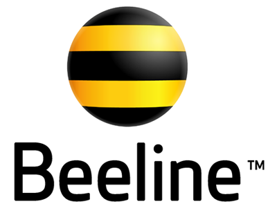
BeforeUntil Oct 2021
Beeline logo via Wikimedia Commons (author: Beeline). Source: commons.wikimedia.org
DownloadLightSVG not availablePNGDark mode version adapted by Rebrand Log
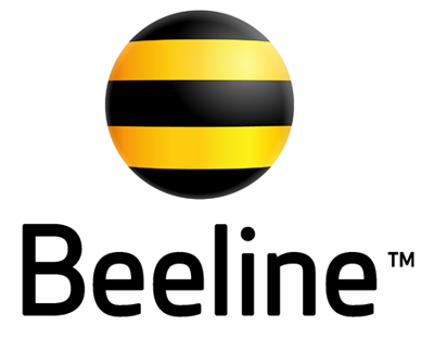
AfterSince Oct 2021
Beeline logo via Wikimedia Commons (author: 2021 brand identity: Contrapunto.[1] Custom typography and wordmark development:). Source: commons.wikimedia.org


Key facts
Beeline launched a new logo in Oct 2021, designed by Contrapunto.
- Brand
- Beeline
- Launched
- Source: kommersant.ru
- What changed
- Oct 2021 (Contrapunto): first rebrand since 2005.
- Why
- Beeline said writing its name only in lowercase emphasised humanity, simplicity and digital character.
- Sources
- interfax.ru, sostav.ru, skillbox.ru
Cite this Rebrand Log, "Beeline new logo (2021)", https://rebrandlog.com/rebrand/beeline-2021/, last updated .
The Beeline rebrand, explained
On 14 October 2021 VimpelCom updated its Beeline brand, logo and slogan, keeping the famous yellow and black. Interfax reported the company's description: the striped logo gains dynamism and liveliness and turns to face the person, without losing recognition. The name is now written only in lowercase, beeline in Cyrillic, which the operator said emphasised humanity, simplicity and digital character. Skillbox noted that it was the first rebrand since 2005.
The new slogan plays on brightness: the bright side is only one of many sides of life, choose the one closest to you, and beeline is on your side.
Interfax reported that the brand update was developed by Contrapunto, part of the BBDO group, with advertising campaigns by Leo Burnett Moscow, and that no extra spending was required because the work was paid for within the approved advertising budget. An in-house team updated the website and released a new mobile app.
In a piece for Sostav, the company's marketing lead explained the logic. The new chief executive had first focused on network quality, technology, structure, products and the customer journey, and it became clear that without an updated identity customers would not soon notice what was changing. Work started about a year earlier, with detailed work on the logo, fonts and creative frameworks from spring 2021. Contrapunto was chosen, she wrote, because it had worked with the company for several years and knew it well.
The decision to keep the stripes was correct. Beeline's yellow and black is one of the most recognisable telecom identities in the region, and throwing it away would have been vandalism. Turning the symbol to face the viewer and dropping the capitals are subtle moves that make the brand feel warmer. It is a modest update, but in telecoms modesty is underrated.
In short: Same stripes, new angle.
Sources
- 1. kommersant.ruhttps://www.kommersant.ru/doc/5030706
- 2. interfax.ruhttps://www.interfax.ru/business/797277
- 3. skillbox.ruhttps://skillbox.ru/media/design/v-bilayne-proveli-rebrending-vpervye-s-2005-goda/