Acer (2001)
New logo.
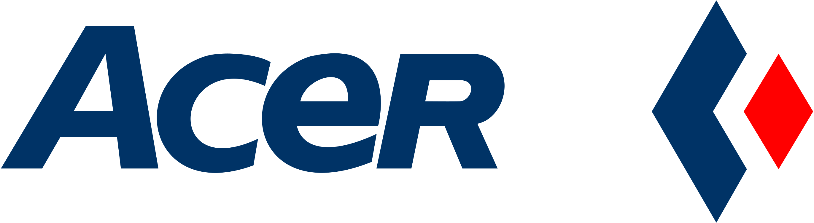
Acer logo before and after
BeforeUntil 2001
Acer logo via Wikimedia Commons (author: Original: Unknown authorUnknown author). Source: commons.wikimedia.org
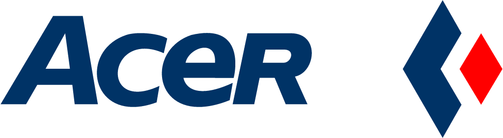
AfterSince 2001
Acer logo via Wikimedia Commons (author: Unknown authorUnknown author). Source: commons.wikimedia.org




Key facts
Acer launched a new logo in 2001, designed by Landor Associates.
- Brand
- Acer
- Launched
- What changed
- New logo.
- Why
- Acer said the new identity reflected its sharpened business focus after separating its OEM and branded businesses, with the diamond dropped to focus on the Acer brand.
- Sources
- benq.com, marketingdirecto.com
- Logo history
- 2 rebrands
Cite this Rebrand Log, "Acer new logo (2001)", https://rebrandlog.com/rebrand/acer-2001/, last updated .
The Acer rebrand, explained
By 2001 Acer was among the world's largest PC makers, with nearly 37,000 staff in 232 enterprises across 41 countries, and a logo built around a symbolic diamond. That year the group introduced a new corporate identity, and the diamond was gone.
The context was structural. Chairman and CEO Stan Shih said customers and innovation would be the two forces driving the company, and pointed to a recent restructuring that separated Acer's OEM manufacturing from its branded business. That split, he argued, let the company streamline execution, target key customer segments and innovate around the customer. A big part of the plan was small and medium sized businesses; Shih noted Acer had itself grown from a small business 25 years earlier, and said the new identity reflected that business focus.
The release spelled out the design reasoning in unusual detail. Dropping the diamond was meant to concentrate attention on the Acer name itself. The new mark was green, which the company said stood for life, growth, prosperity and resilience and set it apart from competitors, while expressing its aim of bringing fresh technology to everyone. The specially drawn letter e and tightly set italic letters were meant to suggest connectivity and underline Acer's push into e-solutions, and the rounded lowercase type was meant to feel friendly, accessible and active.
Landor Associates created the new logo system, and Australian Business Theater developed the wider visual identity system. Spanish trade title Marketing Directo reported the same story from the agency's side, describing the disappearance of the diamond and a new identity based on a strong green and special lettering. Acer also ran a year long brand management programme and an internal teaser campaign to get employees to embrace the new identity and structure.
Read today, the e-solutions language dates the project precisely, but the design aged better than its rationale. Removing a generic symbol and letting a distinctive name carry the brand was the right call for a company trying to stand on its own after shedding contract manufacturing. The italic lowercase wordmark is friendly without being childish, and the green gave Acer a colour of its own, just as the company intended.
In short: The diamond goes; the name, in green, does the work.
Sources
- 1. wikidata.orghttps://www.wikidata.org/wiki/Q481778
- 2. commons.wikimedia.orghttps://commons.wikimedia.org/wiki/File:Acer-Logo_2001.svg