MasMovil
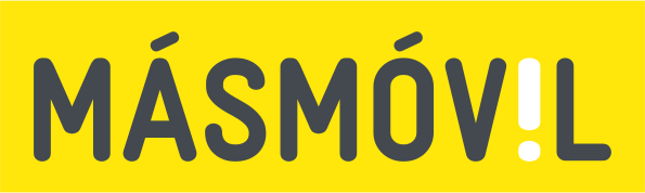
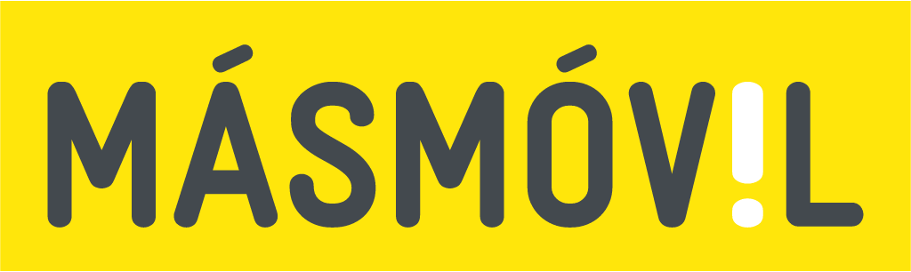
After the MasOrange merger, the yellow MÁSMÓV!L wordmark with accents and exclamation mark became a monochrome black MasMovil wordmark.
MasMovil logo before and after
BeforeUntil Jun 2024
MasMovil logo via Wikimedia Commons (author: Andreuvv). Source: commons.wikimedia.org
AfterSince Jun 2024
MasMovil logo via Wikimedia Commons (author: Grupo MÁSMÓVIL). Source: commons.wikimedia.org


Key facts
MasMovil launched a new logo in Jun 2024.
- Brand
- MasMovil
- Launched
- Source: adslzone.net
- Studio
- Not recordedAdd it
- What changed
- After the MasOrange merger, the yellow MÁSMÓV!L wordmark with accents and exclamation mark became a monochrome black MasMovil wordmark.
- Sources
- movilonia.com, adslzone.net
Cite this Rebrand Log, "MasMovil new logo (2024)", https://rebrandlog.com/rebrand/masmovil-2024/, last updated .
The MasMovil rebrand, explained
The Spanish operator known for its yellow brand changed its logo quietly in June 2024. Movilonia reported that only weeks after the long awaited union of Orange and MásMóvil into MasOrange, the operator's website and some services, such as its energy offer, showed a logo different from the one used since 2011. ADSLZone described it as MásMóvil updating to MasMovil, following the example of the main brand MasOrange.
The changes are reductive. Both outlets reported that the two accents on the a and o are gone, as is the exclamation mark that replaced the letter i, and that the logo abandons yellow for a monochrome black version. Movilonia explained that the new logo is the black version of the mark the company already used to represent its whole group of brands, with all eight characters in capitals and the first three letters, MAS, drawn in a heavier stroke than the rest. ADSLZone also noted a change of typeface and read the move as MasOrange wanting its brands to share a common visual identity.
Both outlets traced the history. MásMóvil launched in late 2006 with a hand making the call gesture, which Movilonia noted doubles as the surfers' shaka greeting, plus the .es domain in the logo. A 2008 restyling flattened the type and shifted the yellow toward orange. In 2011 came the most radical change: a pure yellow, no hand and no domain, just type, with two accents and the white exclamation mark. Movilonia called the 2024 update not very drastic, the third renewal in 18 years.
This is brand architecture dressed as a logo change, and it shows. Dropping accents is practical for digital use, but the exclamation mark was the one witty detail in an otherwise plain wordmark, and stripping out yellow from the yellow operator, as both outlets call it, removes its most obvious cue. The heavier MAS rhymes with MasOrange, which is clearly the point: the brand now reads as a member of a portfolio rather than a challenger with a personality. Good for group consistency, bad for charm. ADSLZone noted that parts of the website still read MásMóvil at the time, so even the rollout was quiet.
In short: The yellow operator goes black.
Sources
- 1. adslzone.nethttps://www.adslzone.net/noticias/operadores/masmovil-actualiza-logo-estilo-masorange/
- 2. movilonia.comhttps://www.movilonia.com/noticias/nuevo-logotipo-masmovil-2024/