Eventbrite (2016)
New logo.
Eventbrite logo before and after

BeforeUntil May 2016
Logo: Eventbrite. Source: eventbrite.com (archived)


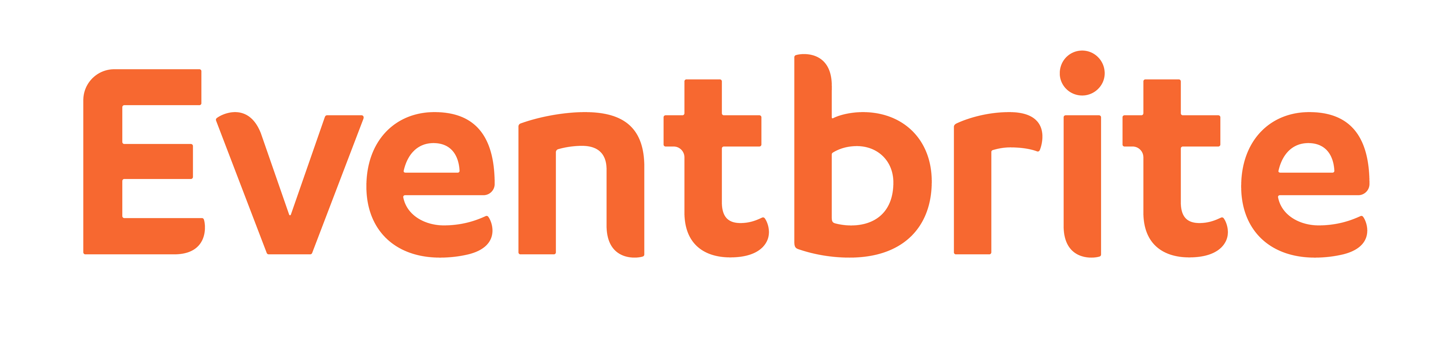
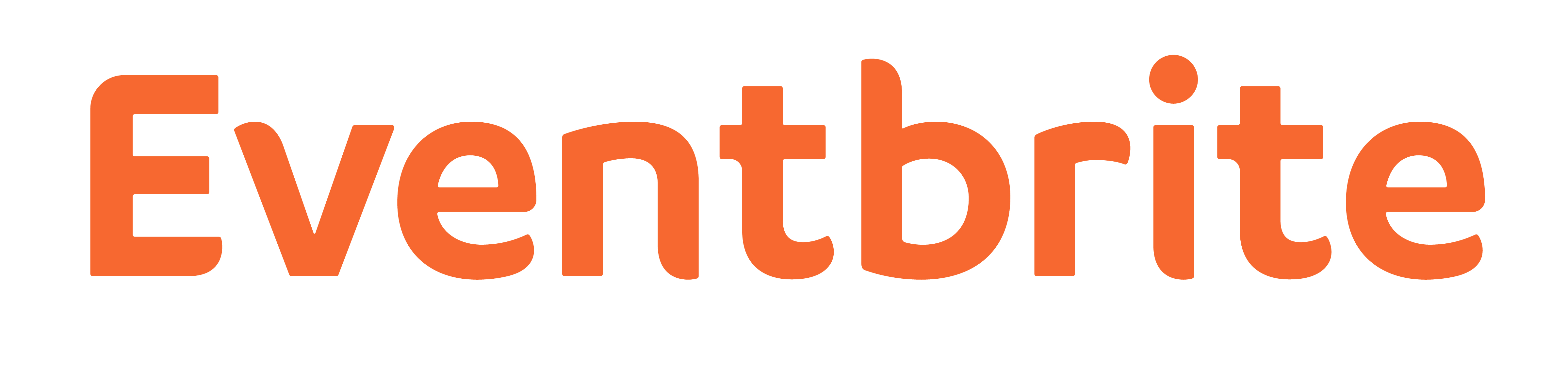
AfterSince May 2016
Eventbrite logo via Wikimedia Commons (Eventbrite wordmark orange.jpg). Source: commons.wikimedia.org
DownloadLightSVG not availablePNGDark mode version adapted by Rebrand Log
Key facts
Eventbrite launched a new logo in May 2016, designed by Eventbrite in-house.
- Brand
- Eventbrite
- Launched
- Source: underconsideration.com
- Studio
- In-house at Eventbrite
- What changed
- New logo.
- Logo history
- 3 rebrands
Cite this Rebrand Log, "Eventbrite new logo (2016)", https://rebrandlog.com/rebrand/eventbrite-2016/, last updated .
The Eventbrite rebrand, explained
Eventbrite was founded in 2006 and, by 2016, had processed around 200 million tickets, which made it the world's largest self-service ticketing platform. That May, Transform magazine reported that the company had redesigned its visual identity in-house.
The most visible change was a reversal. The original palette put white lettering on orange; the new one sets orange lettering on a white background. The typeface changed as well. Omnes, the rounded face of the old wordmark, was replaced by a hybrid formed from Lineto's Circular and FF Cocon, with curves in the letters that Transform said gave the Eventbrite personality a new edge.
Those are the facts, and they are modest. This was not a reinvention but a tune up, and doing it in-house shows. The team clearly understood what was worth keeping, chiefly that orange, and what had dated, chiefly the soft, bubbly lettering that placed the old logo squarely in the web 2.0 era.
The colour flip matters more than it might seem. An orange box with a white name inside is a sticker; orange letters on white are a signature that can sit on a ticket, an email or a lanyard without dominating it. For a platform whose brand mostly appears alongside other people's events, that restraint is useful. The organiser's poster is the star and Eventbrite is the credit line.
The hybrid typeface is the clever part. Circular brings the geometric clarity that was everywhere in 2016, while Cocon's quirks stop the result looking like every other startup using the same geometric sans. It is a small act of differentiation, and a smart one, because in a crowded field the details of the letters are often all a wordmark has.
In short: Orange, inside out.
Press
Sources
- 1. underconsideration.com · paywalledhttps://www.underconsideration.com/brandnew/archives/new_logo_for_eventbrite.php
- 2. eventbritehq.comhttps://eventbritehq.com/eventbrite-design-an-evolutionary-process-2da06cdeb8fa
- 3. transformmagazine.nethttps://www.transformmagazine.net/articles/2016/transformtuesday-17-may