Tele2
New logo.
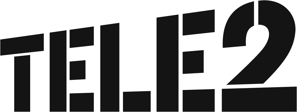
Tele2 logo before and after
BeforeUntil 2007
Tele2 logo via Wikimedia Commons (author: Unknown authorUnknown author). Source: commons.wikimedia.org


AfterSince 2007
Tele2 logo via Wikimedia Commons (author: Tele2). Source: commons.wikimedia.org
Key facts
Tele2 launched a new logo in 2007.
- Brand
- Tele2
- Launched
- Studio
- Not recordedAdd it
- What changed
- New logo.
- Why
- Tele2 said the old logo was too static and it wanted a common European identity conveying its position as a challenger.
- Sources
- dagensmedia.se, markedsforing.dk, aripaev.ee
Cite this Rebrand Log, "Tele2 new logo (2007)", https://rebrandlog.com/rebrand/tele2-2007/, last updated .
The Tele2 rebrand, explained
Tele2 entered markets as the cheap challenger, and for four years in Denmark its mascot was Small Bill, fighting the Big Bills. On 5 March 2007, Dagens Media reported, the Stockholm based operator changed its graphic identity for all of Europe, the first time it had created a common identity across its markets, with the aim of having it in place in up to 20 European countries by the end of the year. Small Bill was retired the same evening.
The old logo, with a dot before and after the company name, was scrapped. Anna Stinger, Tele2's brand chief for Europe, told Dagens Media it had been too static: a dot on each side was limiting, riveted in place. The new logo, created by the Gothenburg agency Happy, tilts gently upward at eight degrees to give Tele2 new ways to stand out in advertising, and the signal colour became yellow, chosen, Stinger said, because it was already in the European palette, strong like road signs, and available. Dansk Markedsføring reported that yellow would be used in advertising and black in the logo, with yellow meant to signal speed and activity and the logo dynamism and constant movement.
Markets followed in turn. Äripäev reported that Tele2 Estonia adopted the identity from May, with marketing director Kristjan Seema saying it would tie product lines and campaigns into one whole and signal that Tele2 was a strong international company; the paper confirmed that Happy, a subsidiary of Forsman & Bodenfors, developed it. In Denmark, chief executive Thomas Nistrup explained that Tele2 still wanted to be cheapest but also to reflect expectations of good service and high quality, under the new line Why pay more?
The tilt is a cheap trick that works. Eight degrees of lean turns a plain black wordmark into something that looks like it is going somewhere, and yellow, by Stinger's own account simply available, is loud enough to carry the advertising alone. The logic is sound too: a challenger operating in many countries needs one face. What the identity does not solve is the contradiction in Nistrup's brief, being the cheapest while promising quality. Black and yellow look like discount, which may be exactly the point.
In short: Eight degrees of attitude.
Sources
- 1. wikidata.orghttps://www.wikidata.org/wiki/Q309865
- 2. commons.wikimedia.orghttps://commons.wikimedia.org/wiki/File:Tele2_logo.svg